Recent Obituaries of Interest
For your edification... some more obituaries...

JESSE STONE, 97, Developer of Rock's Early Hits
Courtesy of The Associated Press
ROCKIN' IN THE GRAVEYARD
For your edification... some more obituaries...
Recent Obituaries of Interest
JESSE STONE, 97, Developer of Rock's Early Hits
Courtesy of The Associated Press
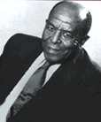
Jesse Stone, who wrote "Shake, Rattle and Roll" and helped develop many of the Atlantic Records label's biggest rock-and-roll hits, died on Thursday after a long illness. He was 97.
As a writer, producer and arranger at Atlantic, Stone worked with artists like Ray Charles, Big Joe Turner, the Drifters and the Clovers. Among his other songs were "Idaho" and "Money Honey."
In 1974, the head of Atlantic Records, Ahmet Ertegun, said, "Jesse Stone did more to develop the basic rock-and-roll sound than anybody else."
Stone's wife, the singer Evelyn McGee Stone, said that even on the day her husband was hospitalized for the last time he had begun writing a song while he watched her playing with their dog.
"I had been saying to the dog, 'That's it, that's it,' and he wrote a song, and that's the title," she said.
The grandson of Tennessee slaves, Stone had a career that embraced minstrel music, folk songs, dance tunes, rhythm-and-blues, rock-and-roll and jazz. He helped build Atlantic Records into a top rhythm-and-blues label in the late 1940's and early 50's, signing stars like Ruth Brown.
"Her first record came out: Bang! It was a hit," Stone said in a 1991 Associated Press interview. "We got a group called the Clovers. Their record came out. Bang! It was a hit. Everything we touched after that went over big. Sometimes we had four or five records on the chart at the same time."
Stone and Bill Haley, who had a Top 10 hit in 1954 with Stone's "Shake, Rattle and Roll," paved the way for the acceptance among whites of what had been considered "Negro music."
"A white man recording black music," Stone said of Haley in the interview. "That's when white people began to buy this stuff. They could hear it on the air."
Elvis Presley's nationwide success the following year cemented the foundation laid by black singers, many with Stone's tunes and arrangements.
Earlier, Stone's jazz tune "Idaho" was a big hit for Guy Lombardo, selling three million copies in the mid-1940's. Benny Goodman and Jimmy Dorsey also had hit recordings of the tune.
Stone was born in Atchison, Kansas, on Nov. 16, 1901, and started performing at age 5, touring with his family's minstrel show. In the 1920's he led a jazz group that included the future saxophone legend Coleman Hawkins.
Stone, who also wrote under the name Charles Calhoun, was inducted into the Rhythm-and-Blues Hall of Fame in 1992.
He is survived by his wife.
Sunday, April 4, 1999
SAUL STEINBERG, Epic Doodler, Dies at 84
By Sarah Boxer courtesy of The New York Times
Saul Steinberg, the metaphysically minded artist and cartoonist and brooding doodler whose drawings appeared in The New Yorker for more than half a century, elevating comic illustration to fine art, died Wednesday at his home in Manhattan. He was 84.
Steinberg was compared to Picasso, Klee, Mir—, Duchamp, Daumier, Beckett, Pirandello, Ionesco, Chaplin and Joyce. The art critic Harold Rosenberg called Steinberg "a writer of pictures, an architect of speech and sounds, a draftsman of philosophical reflections."
But Steinberg was known to most people, as he lamented late in life, as "the man who did that poster." That poster, one of the most famous American drawings, portrays a New Yorker's shortsighted view of the rest of the world, in which everything in the landscape recedes according to its cultural distance from Manhattan.
Saul Steinberg was not, at least in spirit, an inhabitant of that provincial metropolis he drew. Born in Romania, a country he called pure Dada, and educated in Italy, the home of Surrealism and Fascism, he lived most of his life in the United States. He was enthralled and appalled by America. The Chrysler Building, Uncle Sam, the Easter Bunny, Lady Liberty, Mickey Mouse, crocodiles crawling the city streets, police cars and post offices kept creeping into his drawings.
Steinberg was "a virtuoso of exchanges of identity," Rosenberg contended, and his art was "a parade of fictitious personages." His influences were Seurat, Klee, Egyptian paintings, drawings found in public toilets, primitive art, insane art and embroidery. He had a number of ways of referring to himself in his drawings: as a man in profile, a cat, a dog, a fish, and as a rabbit peering warily out of a man's geometrical head. Steinberg's alter ego was always, Rosenberg observed, "detached, curious, passive and fearful."
The very first picture he sold, in 1935, showed a man staring in the mirror, saying to himself: "Dammit! This isn't me. I got lost in the crowd." That could have been Steinberg's motto. More than once he was photographed with one of his paper-bag masks over his face. That, after all, he once said, is what people do in America, "manufacture a mask of happiness for themselves."
Saul Steinberg was born on June 15, 1914, near Bucharest, the son of Maurice Steinberg, who had a printing and box manufacturing business, and Rosa Jacobson Steinberg, who made cakes that her son found "too beautiful to eat."
Though Steinberg was trained as an architect, he never designed a single building.
After studying sociology and psychology at the University of Bucharest, he moved to Italy and received a doctoral degree in architecture from the Reggio Politecnico in Milan in 1940.
While he was in architecture school, he began his career as an artist. He founded a magazine with Giovanni Guareschi, the Italian novelist, and began publishing his drawings in the magazine Bertoldo.
"The study of architecture is a marvelous training for anything but architecture," Steinberg said. "The frightening thought that what you draw may become a building makes for reasoned lines." Reasoned lines, and lines that reasoned, became his stock in trade. "The doodle is the brooding of the hand," Steinberg once said. The only reason he didn't become a writer, he said, was that he was deprived of being born into "a good language."
His visual language was a thin, sharp line that was always remarking on its own existence. "My line wants to remind constantly that it's made of ink," Steinberg said. "I appeal to the complicity of my reader who will transform this line into meaning by using our common background of culture, history, poetry."
"I think what saves me," he said on another occasion, "is that drawing is close to precision while painting is drunkenness, it's narcissistic -- all that swirling oil."
Often his drawings poked fun at the art of drawing, the artist growing out of his own pen and winding up as a square or becoming entangled in his own rococo fancies or unable to break out of a never-ending spiral.
Steinberg's art also played on the theme of emigration and the bureaucratic guises of identity: passports, fingerprints, signatures. He had plenty of experience with those things as a foreign Jew living in Milan under a Fascist regime that was growing more anti-Semitic. His diploma in architecture was awarded by Victor Emmanuel III, King of Italy, King of Albania and Emperor of Ethiopia (after Mussolini's conquest) to a man identified as "of the Jewish race" ("di razza Ebraica").
"The beauty for me," Steinberg told Robert Hughes of Time magazine in 1978, "is that this diploma was given by the King; but he is no longer King of Italy. He is no more King of Albania. He is not even the Emperor of Ethiopia. And I am no architect. The only thing that remains is razza Ebraica."
In 1941, in the midst of World War II, he fled Italy for the United States using what he described as a "slightly fake" passport that he had stamped with his own rubber stamp. It got him to neutral Portugal and then as far as Ellis Island, but he was deported to Santo Domingo because the tiny quota for Romanians was already filled. From there he sent The New Yorker some cartoons, hoping the magazine would support his entry into the United States. Eventually that happened. His art preceded him.
His first New Yorker drawing appeared on Oct. 25, 1941: an artist's playful rendition of a reverse centaur, one with a man's rear end and a horse's head. Steinberg himself arrived in 1942.
The following year, 1943, was momentous for Steinberg. He had his first American one-man show, at the Wakefield Gallery in Manhattan. He married Hedda Lindenberg Sterne, a painter. (They were separated in the 1970's but never divorced, and she survives him.) And on the same day that he became a United States citizen he was given an ensign's commission in the Navy. He was assigned to teach Chinese guerrillas how to blow up bridges, and for a year flew the mountainous route known as "the Hump" from China to India, making sure that the explosives reached their destinations.
Then Steinberg was sent to North Africa and Italy by William Donovan, the director of the Office of Strategic Services. His assignment was to draw cartoons that would inspire anti-Nazi resistance within Germany. Steinberg made lurid images of Hitler with skulls hiding behind him and of Mussolini's twisted face with one eye popping out. These and other drawings were dropped behind enemy lines and printed in Das Neue Deutschland, a resistance newspaper created by the O.S.S.
During the war The New Yorker published Steinberg's visual reports from Asia, North Africa and Europe and satiric drawings of Nazis. In one drawing, "Benito and Adolf -- Aryan dancers," Mussolini and Hitler are wrestling half naked. But the artist, now Lieutenant Steinberg, also did drawings of military life: pictures of G.I.'s bewildered by Europe and waiting for mail from home. His pictures were published in 1945 in a book called "All in Line," the first of many collections of his drawings.
In 1946, the year Steinberg was discharged from the Navy, he received his first major recognition as an artist when his work was included in the show "Fourteen Americans" at the Museum of Modern Art.
After the war his style changed, becoming more abstract, philosophical and symbolic. In the 1950's he devised a whole roster of characters: cats, sphinxes and empty-looking men and women, then crocodiles (his emblem for primitive political society), horses and knights. One memorable drawing featured a knight about to spear a giant bunny. ( Steinberg called this a moral drawing: "Should he be destroyed, or should he be educated?") Women in his drawings also appeared as heroic medieval knights, with spiked heels, makeup that resembled war paint and handbags and umbrellas that looked like weapons.
By the 1960's Steinberg's work was filled with geometrical forms, baroque comic-strip balloons, letters of the alphabet, numbers, punctuation marks, false passports, stamps, legal documents and government regulations on matters like dragons and monologues. He was particularly attached to the question mark, which he drew hovering overhead, embraced in bunches or carried like a briefcase. He traced his obsession with punctuation and letters to his father's printing business in Romania, in which condolences like "Crushed by Sorrow" were printed in big wooden type.
In the late 1960's and 70's Steinberg branched out. He did architectural fantasies, watercolor landscapes and vicious pictures of New York street life that indicated a pessimism about urban life: Mickey Mouse as a terrorist in boots, doormen as saluting soldiers, building facades as frightening mazes. He made a library of rubber stamps, with which he canceled his drawings, and postcard landscapes. He also made a series of "tables," which were wood constructions full of visual puns -- rulers, brushes, erasers and pens -- painted onto the surface.
"His drawings are, in a sense, anthologies of art history," the critic Hilton Kramer once wrote. "There are Cubist and rococo characters. Expressionist conversations, Renaissance objects. Gothic words and Pointillist emotions. There is a kind of primitivism in all this, an animism, for everything in Steinberg -- even the most inanimate object or abstract thought -- is teeming with feeling, aspiration, ambition and portents. Numbers are erotic, words are predatory or faltering, a coiffure may be cerebral, or a boot didactic. Steinberg sees experience itself as a parody of experience, with 'style' the only reliable clue to its mysterious gyrations."
In his many guises Steinberg always portrayed America with a mixture of bemusement and mockery. He traveled to all 50 states and enthused: "I'm crazy about the Dakotas. And Nebraska! . . . The sunsets in Arizona are watercolors."
He was fond of diners, motels, kidney-shaped swimming pools and highways, and he thought the country was best seen from the height of a bus window. He was a European sophisticate posing as a regular American guy. Roger Angell of The New Yorker recalled that Steinberg became such a baseball fan that "he acquired a Milwaukee Braves uniform that he used to put on to watch the games on television."
But for all Steinberg's amusement with America, he remained an outsider, with a cool European perspective. "He fixed on American life without being too close to it," said Edward Koren, the cartoonist. And he filtered it all through an analytic pen.
Although Steinberg arrived in New York around the same time as some of the Abstract Expressionists and collected the works of de Kooning, Klee, Picasso, Baziotes, Giacometti and Guston, he saw himself working against the expressionist grain. He once called expressionism the antithesis of humor. "I believe the artist's feelings must be sublimated and objectivized through the language of art," he said.
Rosenberg observed, "Instead of seeking 'contact' (Pollock's term) with the singular, unattainable self, Steinberg conceived the theater of Abstract Man, Anybody (and his wife), in their countless poses, self-disguises and self creations."
Steinberg's place in the art world was always in question, as he well knew: "I don't quite belong to the art, cartoon or magazine world, so the art world doesn't quite know where to place me." Nonetheless, he made a splash in all three. He did 85 covers and 642 drawings for The New Yorker. He published several books, including "All in Line" (1945), "The Art of Living" (1949), "The Passport" (1954), "The Labyrinth"(1960), "The New World" (1965), "The Inspector" (1973) and "The Discovery of America" (1993). From the start his work was often exhibited in the best museums and galleries.
He had a show at the Galerie Maeght in Paris in 1953 and one at the Sidney Janis Gallery in 1973. And he had a retrospective at the Whitney Museum of American Art in 1978. Still, people never stopped asking, "But is it art?" And for many Americans he remained the man who drew the Manhattanite's view of the world, which first appeared on The New Yorker cover of March 29, 1976. It was subsequently copied in knockoffs made for London, Paris, Rome, Venice, Kansas City, Durango, wherever.
"I could have retired on this painting," if royalties had been paid, he once mused. But they weren't, and he didn't. Finally, sick of the many knockoffs, he sued Columbia Pictures for an unauthorized version of the painting used as an advertisement for the 1984 movie "Moscow on the Hudson." A Federal court ruled in his favor in 1987.
Steinberg may have been an anomalous presence in the art world, but that doesn't mean he fit any more comfortably in the cartoon world. Many cartoonists believe he shunned them. "Steinberg kept away from cartoonists," Koren recalled. "Steinberg was not a warm man. He was chilly and Olympian with a somewhat hauteur tone."
Once, Koren said, the two were together at a dinner party. "I got somewhat in my cups, cheery, and I said, 'You know, Saul, you've been a profound influence on me.' He looked at me chillily and said, 'I would be surprised if I wasn't.' "
Angell said: "There was a strange combination of things in Saul. He was a famous person and a private person." He was always thinking about the constrictions of fame. At his retrospective at the Whitney in 1978, Steinberg spoke about the perils of "retrospectives": "Looking back is a mistake, a taboo. The most famous example . . . is the wife of Lot (fleeing Sodom) who, by looking back, became a pillar of salt . . . a monument."
Steinberg once drew a picture titled "Between Parentheses," which appears to be a meditation on his own fame. In the foreground are flowers and hills and telephone poles. A parenthesis floats above the horizon: inside it is the date 1905 (not Steinberg's birth date) followed by a hyphen, followed by a little man being dogged by a dove flying above him with a laurel wreath that looks like an angel's halo.
Steinberg called it "the portrait of a famous man," and this is how he described it:
"He walks, followed by his birthday and facing his death day. That dash hints at his end, eagerly awaited by historians who can thus officially close the parentheses. The essential thing about him, and this is the essence of fame, is that he is between parentheses. He is not free. This monumentalization of people, this freezing of life, is the terrible curse of the consciousness of fame. Anybody with instinct destroys conventional fame and misleads his admirers and biographers by being unreliable and therefore unpleasant... This gives him the possibility of looking instead of being looked at."
May 13, 1999
TIBOR KALMAN, 'Bad Boy' of Graphic Design, 49, Dies
By Steven Heller, courtesy of the The New York Times
Tibor Kalman, a graphic designer whose innovative ideas about art and society helped change the way a generation of designers and their clients viewed the world, died on Sunday at the Hyatt Dorado Hotel near San Juan, Puerto Rico.
He was 49 and lived in Manhattan.
Kalman decided to spend his last days in Puerto Rico after losing a four-year bout with non-Hodgkins lymphoma, his wife, Maira Kalman, said.
The founder of M&Co, a revolutionary New York design firm that became a social prod to his major clients as much as a graphics resource, Kalman was also the former editor in chief of Colors magazine, an art director and a director of music videos and television commercials.
He was the self-styled bad boy of the graphic design profession and a harsh critic of formulaic or what he pejoratively termed "professional" design. He wanted designers to take greater responsibility for how their work influenced the surrounding culture.
As the designer Milton Glaser asserted, "He emerged in such a short amount of time as a major influence on a young generation."
Kalman described himself as more a social activist than a designer and constantly sought to use his work to promote causes like environmentalism and economic equality. He opposed products that he considered harmful to the workers who made them, the environment or the consumer and never hesitated to tell his clients what he thought.
After spending almost a decade building a business that he said sold "design by the pound" to banks, discount department stores and other institutions, Kalman reinvented M&Co in the mid-1980's as a conceptually progressive firm doing graphics, exhibitions, books, magazines and film titles primarily for cultural clients that included the rock band Talking Heads, the Times Square Redevelopment Corporation and the Whitney Museum of American Art.
He also founded M&Co Labs, which conceived and manufactured watches and clocks with quirky faces and rearranged numerals, products that helped start a fashion for such designer-made objects.
Tibor Kalman was born in Budapest in 1949 and immigrated with his family to Poughkeepsie, N.Y., in 1957 after the unsuccessful Hungarian uprising against the Communist regime. He spent a year at New York University, where he joined Students for a Democratic Society and traveled to Cuba to pick cotton with the Venceremos Brigade, which took middle-class Americans to help support the Communists.
When he returned to the United States in 1971, Kalman learned rudimentary graphic design by doing window displays for the Student Book Exchange at N.Y.U., which was owned by Leonard Riggio, who later bought Barnes & Noble and made Kalman its first creative director. He designed the bookstore's first shopping bag, featuring an antique woodcut of a scribe, which is still used today.
Knowing little about the nuances of typography, however, Kalman hired young design school graduates to execute his ideas while he retained creative control, a practice he continued throughout his career.
A Sledgehammer and a 'Goofy' Room
In 1979 he was hired as the creative director responsible for signs and displays for E. J. Korvettes, the discount department store. Unhappy in this lucrative job, in 1980 he established M&Co in his Greenwich Village apartment. A year later he moved it to an office on West 57th Street in Manhattan. His first work was designing logos for department stores for a bag manufacturer. But Kalman was not content working on such commonplace assignments and decided to change his focus.
The firm's enigmatic name was typical of Kalman's wit. The corporate-sounding cadence was meant to give an aura of mystery and to confuse his more strait-laced clientele, who always wanted to know who the M was. His wife, Maira, a children's book author and illustrator, has the nickname "M," which she donated to the cause.
Kalman's new office was designed to establish an unconventional aura and featured what he called "a goofy, triangular-shaped table that fit into a goofy-shaped conference room," as well as a hole smashed out of one wall by a sledge hammer for a reception window.
Kalman's metamorphosis into a progressive design impresario came when M&Co designed a Talking Heads album that featured four digitally manipulated photographs of the group members (before personal computer software made this a common graphic conceit) and a title with upside-down letters. From then on, M&Co received attention in the design trade press for pushing beyond the conventions of design and typography.
Urging Designers to Be Responsible
Kalman soon moved his office to a downtown loft that he had designed to simulate the interior of an old factory. This was consistent with his passion for vernacular design. He encouraged his designers to apply the handmade signs and common methods used by neighborhood printers who do menus and handbills. Ultimately, vernacularism became a way for him to protest the corporate International Style.
As a frequent lecturer and a writer of acerbic manifestoes, Kalman urged designers to take more responsibility for their work's impact on society and culture. In 1986 he was co-chairman of the American Institute of Graphic Arts' national conference in San Antonio, called "Dangerous Ideas." It was the first such major event to focus attention on how designers contribute to environmental waste and promote products that harm people or the environment.
M&Co became Kalman's soapbox. To address homelessness, he sent boxes with the contents of a typical city shelter meal to clients one Christmas season instead of the usual presents, noting that M&Co would match all monetary contributions.
Graphic design was too small a platform for Kalman. He gradually moved away from graphics as such to editing and creative direction for the magazines Art Forum and Interview. But perhaps his most meaningful job was as editor in chief of Colors, the Italian and English magazine published by the Italian clothing company Benetton, an assignment that forced him to discontinue M&Co temporarily and move his family to Rome.
Colors, founded by a photographer, Oliviero Toscani, was not a typical corporate house organ or fashion magazine, but rather focused on sociocultural issues like racism, AIDS and even sports. Colors was "the first magazine for the global village," Kalman said, "aimed at an audience of flexible minds, young people from 14 to 20, or curious people of any age."
Colors became the main outlet for Kalman's ideas. An issue devoted to racism had a feature titled "How to Change Your Race" and examined cosmetic means of altering hair, features and skin color to achieve some kind of platonic ideal. Also in that issue, "What If. . .," was a collection of manipulated photographs showing famous people racially transformed: Queen Elizabeth and Arnold Schwarzenegger as black; Pope John Paul II as Asian; Spike Lee as white and Michael Jackson with a Nordic cast. "Race is not the real issue here," Kalman said. "Power and sex are the dominant forces in the world."
Kalman returned to New York in 1997 after three years as Colors editor to battle cancer. He re-established M&Co to produce and design exhibits, videos and books that had social relevance. Among his projects was a photographic series quoting everyday people's relationship to Times Square, which hung on scaffolding during the recent construction of the Conde Nast building in Times Square, and a series of Op Art contributions to The New York Times Op-Ed page.
During his cancer treatments he also taught a pictorial narrative class to graduate students at the School of Visual Arts and directed work on his monograph, "Tibor Kalman: Perverse Optimist."
In addition to his wife, he is survived by a daughter, Lulu Bodoni, and a son, Alex Onomatopoeia; his parents, Marianne and George Kalman of Gwyned, Pa.; a brother, John of Horsham, Pa., and a sister, Margie of Bristol, Pennsylvannia.
In the last months of his life, Kalman designed the exhibition "Tiborocity," which will open at the San Francisco Museum of Modern Art in July. It will consist of "neighborhoods" representing different aspects of his work as well as the protest posters and graphics that influenced him in the 1960's and 70's. Kalman told friends he intended the retrospective to be his last testament.
May 5, 1999
There are several obit enthusiast sites out there, and each has its own unique take on obituary journalism. Here are some recommended sites you may enjoy as well.

